Friday, August 15, 2008

Friday Feature Church: Shadyside Presbyterian Church, Pittsburgh


As modern churches wrestle with new worship styles and how they affect the physical structure of the church and its furnishings, it is always instructive to look back at the past for what we might learn.

Things are changing now, but they've changed before. And they will again.


(Shadyside, 1875)

"The sanctuary as built in 1890 was very much of its time. Before the mid-nineteenth century, the two predominant sanctuary arrangements were the nave-chancel and the meetinghouse. The former, an ancient arrangement, is well suited to worship that is liturgical, processional and centered on the eucharistic rite. Clergy perform the rite within the chancel and the congregation observes from a long, narrow nave. By comparison, the meetinghouse shape is adapted for preaching and hearing. The room is wide and the depth of the room short – to minimize the distance from pulpit to listener.


(Shadyside, 1890)


Two seemingly incompatible trends – revivalism and a liturgical movement – combined to create a worship space not terribly different than a theater. The Second Great Awakening in the early 1800s was driven by emotional preaching from a stage-like structure with the people arrayed around it. Conversion of lost souls predominated over participatory worship. Later in the century, some congregations came to consider this insufficiently sophisticated for their needs and status. Churches favored more structured worship orders with greater reliance on music and ritual, while still stressing preaching.


A theater arrangement resulted. A stage with a modest pulpit offered the preacher a prominent platform, with freedom of movement. A pipe organ and choir or quartet served as back-drop and satisfied the desire for more formal music. The seating was arrayed in a semi-circle in a proportion neither narrow as a nave nor broad as a meetinghouse. The auditorium floor was often sloped up from front-to-back to promote good visibility and hearing from each seat...This shape was touted in local newspaper accounts, which also noted that all seats faced the preaching position.

The prominent position of the choir and organist suited the growing mid-nineteenth century emphasis on music. Through much of the twentieth century, a skepticism about “performance” in worship moved choirs away from front and center. (In some quarters, this has reversed again, with praise bands playing and singing from stages in “contemporary” worship.) ....By the third and fourth decades of the twentieth century, ideas about worship space were changing in the United States . Many “mainline” churches responded to yet another liturgical impulse. A more archeological correct neo-Gothic movement in architecture prescribed a nave chancel-arrangement.


(Shadyside, post 1938)

Shadyside responded in 1937-38. That change placed a greater specific emphasis on worship in both Word and Sacrament. Four specific liturgical centers (pulpit, lectern, table and font) are in prominent view. It accords well with the present order of worship, increased frequency of communion and high standard of preaching. In fact, a case can be made that the architecture has influenced worship as well as responded to it. "


What 'innovations' that we are making now will be discarded? Which will be kept?

How do we make a building that will be flexible enough to remain in use (as has Shadyside) for over 100 years?

Wednesday, August 13, 2008

Having Church Outside--Community Church, Simi Valley, California


The most innovative feature of Community Church's building plan for a 138 acre site is the decision to have church outdoors--in an outdoor sanctuary, and save the millions of dollars that would have been spent on the building for direct ministry use.

From their website:


"In developing our property we want to reflect the loving/giving nature of God. We want to build an outdoor amphitheatre rather than an auditorium so we can give more to the poor. We want to provide land to Children's Hunger Fund to support and serve children in need locally and internationally. We want to create a park-like atmosphere for our community to enjoy.

Cornerstone Community Church & Eternity Bible College Facilities
Outdoor Sanctuary – 3,000-person capacity
Gym/Multi-Purpose Building – 1,000-person capacity
Chapel/Multi-Purpose Building – 300-person capacity
Administration Building with Library
Classroom Buildings
Maintenance and Restroom Buildings
Children's Hunger Fund Facilities
Administration Building and Learning Center
Warehouse/Packing Buildings
Athletic Fields
3.8 acres of shared-use athletic fields (no night lighting)
Use by local community will be encouraged
Onsite Wastewater Treatment Facility
Creates tertiary-treated recycled water for irrigation
Comparable to other systems used in unincorporated County areas
Onsite Parking Facilities
2,000 parking spaces
Eco-friendly "grass-crete" pavement
Open Space
Approximately 58.8 acres of preserved open space
Only 3% of total site area developed

While year-round church outdoors is only a realistic option for friendly climates (Community Church is located in Simi Valley, California), it's high time for a rethink of vast, expensive spaces used once a week.

I admire Community Church's well-thought out expression of goals for the site, and the innovative solution they found to ensure that what they build is in keeping with what they value.

My church is also blessed with a large site--100 acres--and plans to develop part of it as community park space. We hope to include an outdoor amphitheatre, though our climate won't allow it to be in use year round.

Inspiring!

Thursday, June 5, 2008

Cheap Fix - Linoleum remnant flooring


Above, a lineoleum remnant floor as a study model, partially laid, and completed. Via materialicio.us , this lineoleum is a surprisingly stylish fix for the church kitchen, or for nursery or youth areas where a hard floor is required. As indicated, make a quick study model before laying the floor. And use the 'real' linoleum, whose color goes all the way through and is highly scratch resistant, rather than the cheap plastic flooring sometimes referred to as linoleum.

It appears that the red linoleum has been used on the countertops as well...another 'cheap fix' which can be finished off with either a wood or aluminum trim piece on the counter's face.

In my neck of the woods, lino remants can be found at salvage yards and the Habitat for Humanity ReStore.

Thursday, May 29, 2008

Youth space DIY Round-Up


DIYable ideas for the youth room: (top to bottom) fluffy clouds made from coffee filters, tennis ball table (lots of hot glue needed), bicycle wheel table, and some funky lighting that looks to me like it is made of guttering that has holes drilled in and rope lights passed through.

Friday, May 23, 2008

'Nappak' for temporary shelter


Churches have traditionally served as gathering places in times of disaster, and my church wants to intentionally plan for this eventuality in design of the new buildings.

Part of that involves being equipped to provide temporary sleeping arrangements....the traditional solution for this is your basic cot, but the 'Nappak' seems a much better answer, providing at least a modicum of privacy that might help victims feel a bit more comfortable in spite of disorienting circumstances. And packing small for storage.

It seems to only be available in Germany at the present time.

Monday, May 19, 2008

Inspired by School Architecture


What does it mean to be making the 'place' of a church?


I've been learning from a document I ran across called "Enabling Place-Making: The Role of the School in Supporting the Community", by Prof. John Worthington, with its thoughts on what school architecture should mean and be.


One of the primary functions of the church is, of course, pedagogical, and so it is no great surprise that many of the principals translate well to thinking about the use and design of sacred architecture...replace 'school' with 'church' and you'll see what I mean.


"Buildings, well considered, can provide support to users by being:


  • efficient, by achieving more with less, reducing running costs and using space well;

  • effective, by improving staff and student satisfaction, adapting to new ways of teaching, attracting community commitment and improving learning outcomes;

  • expressive, of the values of the school and the community. The building, its fit-out and the way it is managed, can be used to transmit ideas and knowledge."

Many churches I've been in are poorly designed for all three. Modern churches, in particular, seem downright afraid of any expression of values, which is why they tend to be shopping-mall bland.


The conclusion of the article has fascinating implications for churches as well:


"Traditional categories of space are becoming less meaningful as boundaries blur and space becomes less specialised. Educational space needs are designed primarily around patterns of human interaction rather than the needs of particular subjects or technologies. New space models are focused as much on enhancing the quality of life as on supporting the learning experience. Circulation becomes the focus for interaction and informal learning.

Space is planned to:

  • support mobility, with touch-down settings, an abundance of power outlets, and movable furniture, and a rich variety of settings;

  • enrich pathways, by designing for chance encounters, encouraging the creation of ad-hoc workplaces, and providing opportunities for creative interaction;

  • blend and blur activities, for working, talking, eating and relaxing, by overlapping information-based work with entertainment, food and leisure.

Success comes through engagement, continuous commitment and attention. Space can be more than an irritant left to others. Space can be the catalyst for achieving pedagogical goals and improving performance."


What does it mean to design a church around patterns of human interaction? As I think about my church's new building(s), my primary inspiration for educational space is not other churches, but innovative schools.


[above, the Shiroishi #2 Municipal Primary School, Tokyo, by Taro Ashihara]


Wednesday, May 14, 2008

Cheap Fix - Simple Wooden Trim


California-based Mars Hill Studios seem to have developed something of a formula for warming up spaces with the application of simple wooden trim. Utilizing raw, unimproved lumber (looks to me like simple pine 2 bys and 1 bys, perhaps waxed for luster), and incorporating the bolts and braces as features of the designs, most of these ideas are within the reach of a lay carpenter, and are especially well-suited to remodels of austere office or shopping space.

(Nice color choice on that purple/green hallway, as well. But at my church I wouldn't be able to *tell* anyone I was painting it purple and green. I'd have to pretend I was painting it a nice, nondescript almond color. Then afterwards, they'd like it, but before....well, the deacons might have a stroke if I mentioned purple and green in the same sentence.)

Tuesday, May 13, 2008

Angling the Pews


From the website of New Mexico based Mazria, Inc.

"The seating arrangement in the Sanctuary is oriented at a 45 degree angle to the Bima, which reinforces the feeling of community during services."

In a older, traditional sanctuary with existing pews, simply changing their angle can make the space seem more friendly, less formal.

At my own church, which has a mixture of pews and chairs, space didn't permit a full 45 degrees, but several years ago we made a simple shift of about 30 degrees, which made quite a difference and was favorably received by the congregation. It also has the effect of better focusing the sight lines onto the center of the stage or the pulpit.

Thursday, May 8, 2008

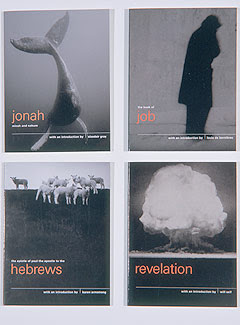
Pocket Canons


London based design group Pentagram's "radical repackaging of the Bible designed to reintroduce the texts to a contemporary audience."

KJV texts with introductions by famous (contemporary) authors, published by Canongate books in the UK. By 2006, the series been published in 12 languages and in 16 countries, selling well over a million copies.

Winner of a Publishers' Publicity Circle award in 1998 as well as multiple other design awards.

There's nothing inherently spiritual about black leather bindings and gold gothic letters...

[See also the previous post on Crush Co's 'Summer Bible'.]

Church of the Visitation, Texas, 1895


Westphalia, Falls County, Texas. As beautifully photographed by Matthew Magruder for the Texas Church Project, documenting historic houses of worship.

Cross-bracing in the ceiling creates a simple, beautiful rhythm...long before E. Fay Jones used it to spectacular effect at his Thorncrown Chapel.

And what sensitive soul went to the trouble, in 1895, to lay the wood floor diagonally?

Saturday, May 3, 2008

Study in Contrasts in Iceland


The aesthetic strength of this church building comes from the contrast between the rough, rustic quality of the dark cladding and the refined elegance of the bright-white trim. This would be a striking choice of finish materials for a small church, without resorting to anything unusually expensive.


Friday, May 2, 2008

But can I call it stained glass?


The pendant light made from Campari soda bottles by Ingo Maurer. About $600 (for soda??) so make your own. Great for the youth room.

Thursday, April 17, 2008

Chapel of St. Ignatius, Stephen Holl, 1997, Seattle, Washington


So, the post I meant to publish last week--before the Crisis in the Lab and the Wedding of the Brother intervened-- was about St. Ignatius, another chapel whose design and symbology centers around light.

Steven Holl describes the chapel as a stone box containing seven 'bottles' of light. Skylights and colored glass are used to create seven different qualities of light, corresponding to elements of the (Roman Catholic) liturgical progression:
1. Procession – natural sunlight 2. Narthex – natural sunlight 3. Nave – yellow field with blue lens (east); blue field with yellow lens (west) 4. Blessed Sacrament – orange field with purple lens 5. Choir – green field with red lens 6. Reconcilation Chapel – purple field with orange lens 7. Bell Tower and pond – projecting reflecting night light

The interior of the chapel flutters with patches of colored light, as if inside a very slow-turning kaleidoscope. It is frankly brilliant.

I do find the exterior disappointing; the stone bottles rising from the box seem awkward and piecey, uncohesive. Nevertheless, this is a building I would travel to see.

And having something of a background in optics I love the front door, which has seven lenses (repeating the seven bottles theme) set in at different angles to rotate light into the interior at different times of the evening.

Whether this style of building would suit your church or not, let it inspire you to carefully consider the power of not just the presence of light, but its nature (color, intensity), its progression (time of day and season), and its absence (shadows) as well.


The best photos of the chapel are by Liao Yusheng at figure-ground.

P.S. I wish I knew what the finish on the (concrete?) interior is, creating the slightly 'blotchy' pattern. Any help?

Church of the Light, Tadao Ando, 1989


Today, two churches that are uniquely centered around light...

The first is Tadao Ando's Church of the Light in Osaka Japan which is well-known in architectural circles but, paradoxically, not in church-y ones.

Though Ando certainly works in a minimalist fashion, the asceticism of this church was as much an issue of low budget as of aesthetics. The contractor donated the construction of the roof when funds ran out and the church pews and the floorboards are made of construction wood salvaged from concrete forms and scaffolding.

Ando is an architect by talent, not by training. He has no formal education in the field but nonetheless received architecture's highest award, the Pritzker Prize, in 1995.

Church of the Light is quite small, and its all-concrete construction has been described as claustrophobic by some. But it demonstrates well the power of light, the possibilities of negative space, and the wisdom of putting your money where it counts, in a strong, central focal point.

[Lovely images, above by Liao Yusheng. An excellent tour of the entire site, which gives some sense of the way the unique concrete forms of the church are experienced, is here. And of course, there is a Wiki on the Church of the Light.]

Tuesday, April 8, 2008

On Being Light, Having Light, Installing Light


If I had a limited budget with which to improve a church property I would spend it on two things: paint and lighting.

Given the prominence of light symbology in the Christian tradition, I wish churches paid more attention to it. Technology has made its opportunities boundless, and cheaper than ever.

Take a browse through one of my favorites, Tillett lighting, and be inspired.

Monday, April 7, 2008

Hadid's Aqua table

I'm not a fan of Zaha Hadid's work, but I do find her 'Aqua' table inspirational in thinking of unique forms for an altar or communion piece. The silicone top is translucent, so that the organic 'legs' beneath appear as deeper pools of color. [currently selling for $78,500...so use it as inspiration to make your own.]

Saturday, April 5, 2008

The Great Church Pew Debate


Next to music, it is perhaps the issue of the church pew that divides the traditionalists from the trendoids. I've seen debates over this simple, mundane piece of furniture lead to shouting matches and folks leaving the church. May I point out that, whatever your view on the pew, it's not worth that?

Pros:

1. Tradition - Some people have a visceral, positive reaction to a worship space containing pews, born most likely out of their prior religious experience. Pews, to them, look and feel like church.

But this applies to the 'unchurched' as well...as evidenced by the fact that many non-churchgoers want a church with pews for their wedding.

When pews have been in a church a long time, members may see them as imbued with the prayers and spiritual aspirations of congregants who have worshipped there before them.

If kneeling collectively is an important part of your church tradition, pews with kneelers are still the best way to accomplish it.

I think it's important to point out to Americans that in many European churches, the pews are part of the furnishings of a protected historic building and changing them is forbidden. This would apply to only a few congregations in the US.

2. Flexibility - This is the pew's greatest practical strength. While pews are inflexible within the FLOOR space (see below), the SEAT space of the pew itself is very flexible. Because there is no designated, 24 inch seating area, as with a chair, a larger person can take up more space, and a smaller person less. A pew can be 'packed' for special events, temporarily expanding the sanctuary's seating capacity. Spacing is organically adjusted for relationships--families and couples can sit closer, or an appropriate personal space can be kept between strangers. Children can lie down on their parents' laps. I've noticed tired children shifting around in chair seating, unable to rest their head comfortably.

3. Comfort - modern pews with padding are as comfortable as chairs. And do we really want to offer people the equivalent of a lazy-boy recliner, anyway?

4. Expense - Though expensive new, pews that are used are widely available, often for free or just for transport.

5. Underlying spatial philosophy - pews are 'shared', chairs are your 'own'.


Cons:

1. Tradition - Some people have a visceral, instinctive dislike of a worship space containing pews, again, likely due to past religous experience. It also seems, however, to be a reactionary position taken up by long-time churchgoers without particularly bitter memories in an effort to be somehow modern. Is it possible to be a 'modern' church using 'traditional' furniture?

2. Flexibility -This is the pew's greatest practical drawback. If you want to use the sanctuary space for more than one purpose, or use a lot of different worship space configurations, it's tough to move pews and nearly impossible to store them. Pews don't stack well.

3. Comfort - There is no doubt that vintage or antique pews were made for people of a smaller average size than those of today. And they'd never heard the word 'ergonomic'.

4. Expense - New pews are much more expensive than new chairs.

5. Underlying spatial philosophy - pews are 'shared', chairs are your 'own'


My take:

If your pews have a long historic tradition in your congregation, keep them and modernize in other ways. The costs of discarding your history are too high. Try to add padding and footrests for additional comfort if you can.

If you really need to completely reconfigure your sanctuary frequently (at least once a month), chairs are the only and obvious choice.

It's been my experience, however, that many churches think they'll do this and then never do, usually because moving alot of chairs is really hard work. (Believe me, I know. It is not uncommon for the pastor's family to pull janitor duty). If you are using chairs in fixed positions (which is like pews anyway), the clean, strong line of a pew is more aesthetically pleasing, and will allow the aforementioned flexibility within the seating space.

Personally, I wouldn't even consider fixed, theater style seating, which has the immovability of pews but none of their flexible-spacing advantages. It combines the worst of both options.

If you're buying, consider specifying shorter pew sections combined into longer lengths, as it is the long pews that are the most inflexible within the floor space. Consider areas (around the stage? near the back? a flexible central area?) where you might want to remove or change seating for special events and use chairs there. This can also be done in sanctuaries with existing pews, where replacing selected pews with chairs can increase the options for floor arrangments, allowing for instance, a circling of chairs around the stage for smaller gatherings.

And that brings me to my final thought, why is it pews OR chairs? A combination of the two would work well for many churches.

Pews/no-pews can't answer what it means for a church to be relevant in the modern era. It's not even the right question. What is at issue here is simply the practical consideration of what seating style is best for your church.


Pricier Wall Fix - the Wovin wall system


Pricier, but with enough texture to make an impact in a larger space such as a sanctuary or gathering room, are these Wovin wall tiles. From Australia,but they ship world-wide.

From their site:
"The Wovin Wall System consists of a lightweight mounting grid which can be fixed to any wall or ceiling surface. The Wovin tiles are clipped into this grid in alternating directions to create the distinctive woven pattern...Walls do not require surface preparation prior to installation, as inconsistencies in finish or flatness are hidden by the tiles. Masonry and panel-lined walls can all accept the light-weight grid..."

I prefer the wood tiles, but they come in other finishes as well, including translucent models for back-lighting, metals, and custom printed options.

Friday, April 4, 2008

Cheap Wall Fix Round-Up


A few inexpensive ideas I've kept track of for making a beautiful accent out of an existing wall or part of a wall, or covering up a case of the uglies (sigh, I have known many such church walls...and having a budget of maybe $50 to improve them).

Standing pebble tiles from naturalstoneoutlet.

Wood tiles (from my files, no source unfortunately, but a relatively straightforward DIY)

Raffia wall by designer Paolo Lenti but I've seen placemats that looks like this and in fact the new heavy, architectural placemats, often made from real wood, are great en masse on a wall.

Interlocking frames or a simple pattern of thin wood strips painted the same color as the wall are a great disguise...look to garden treillage for inspiration. But don't use that ugly pre-made stuff from the lumber yard.