Wednesday, December 26, 2007

Cheap Fix - Acoustics


This post is the first in what I hope will be a series of 'cheap fixes'...for those who have an existing, less-than-perfect building and limited funds with which to improve it. Which is most of us, isn't it?


I've recently become aware that the cardboard tubes used for concrete forms (and readily available at big box home improvement stores) are great for improving acoustics in a large, echoing room such as a sanctuary. That's them on the back wall of a worship space, above, from the website of edb sound acoustics. A quick google shows that this is apparently an accepted DIY procedure in sound rooms and the like.


The placement and size of the tubes changes the effect...they are cheap enough to experiment with for what best suits your sanctuary. Paintable to match the walls when you're done (as above), though the bright yellow label with block printing would be cool as-is in a youth space!
UPDATE: more details and photos of how this works can be found at All Church Sound

Tuesday, December 25, 2007

Dairy House by Charlotte Skeen Catling


My home church's property was formerly farmland, including a dairy.

This design, another one of the Bombay Sapphire prize winners, makes me think of the genius of that place...it is an extension onto a stone dairy converted into a house. Located in Somerset England, but its alternation of glass and rough oak seems to belong even more to the log cabins of the American frontier.

Here is a design that combines modern materials and an innovative approach with historical forms appropriate to the site. Ahhhh.

How is this inspirational for a church design? If it fits the genius of your place, as an entry, small adjunct building (office, chapel) or connecting device between buildings.

Lots more pictures, and construction information, are available at dezeen.

Church Furnishings for Cheap (or free!)


www.usedpews.org is a clearing house for more than just pews....all sorts of used church furnishings are on offer, including baptisteries, light fixtures, stained glass, and theatre-style seating, at prices greatly reduced from new. There are even free items! It is searchable by region as most items must be picked up. Return the favor...if your church is getting rid of furnishings be sure to offer them to another congregation. Some of the items currently on offer are above.

Stacking chairs


Church spaces have to be flexible, and this involves the constant moving of chairs. When they are removed, there is the problem of storage. My own church, for instance, doesn't have any storage closets large enough for furniture, and we end up with those ugly 'chair trees' out in the open.

So I was really inspired by this chair from new designer Jennifer Chan....each chair provides storage for a second one! The number of chairs in a room could quickly be doubled or reduced by half with no additional storage required. Not yet commercially available, but perhaps if we give her enough attention...

Cumulus lights by Steven Haulenbeek


This lighting concept utilizes photographer’s translucent shoot-through umbrellas as modular components to create a scalable light canopy. The accumulation of these umbrellas, hung upside down, creates a cloud form. The umbrella is an object that all people can identify with. In my lighting application, the object is recontextualized to create playful light rather than reference the dark and dreary day. The Cumulus Light Canopy can be made to fit the scale of almost any space just by adding or subtracting its modular elements. It can be broken down to a fraction of its size and can be installed and de-installed almost effortlessly.


A beautiful and innovative concept...you could try DIY but Steven lists these at just $300 for a six piece unit (he'll do custom sizes as well), which is amazingly reasonable for a designer's work and cheaper than loads of far less interesting fixtures.

Friday, December 21, 2007

Energy-efficient Facilities


I prefer not to use the terms 'eco' or 'green' because they are sometimes attached to a set of philosphies to which an individual church may not ascribe. But 'energy-efficient' has no such baggage...and did you know that the EPA's 'EnergyStar' program (you know, those stickers you see on appliances) has a special program strand just for congregations?

Useful how-tos, case studies, and technical support. Resources here.

Friday Feature Church: Padre Pio, Foggia, Italy


Italy has stunning church architecture...from the past. Today's NewYork Times has an article on two new Italian churches by architects of note, one of which is Padre Pio, designed by the famed Renzo Piano.

"...some church officials are hoping that a return to architectural splendor will help put people in the pews...I think there will be people who come here to see the architecture, just as in Assisi people go to see the paintings of Giotto,'' said the Rev. Aldo Broccato, the Padre Pio Church's top prelate. ''If more people come to see the church and then they stay in it, I'm even happier.''

Cost: $36 million dollars (!)
Time to build: ten years (!)

Summary: The plan is based upon the spiralling of a snail shell, and technically it is a tour-de-force. From arcspace: ""The worshippers are enveloped by a gigantic snail shape, the outline of which is formed by a three-quarter circle of steadily decreasing radius. The materials, selected to express simplicity and solidity, are local stone, wood and glass. The immense roof skin is finished in pre-patinated copper with a supporting structure of wood and limestone. "

My take: Certainly an interesting use of forms and materials, but too clever by half. For all its technical virtuosity, the structural complexity seems to trap, rather than to free, the space. The main issue for me is that the low angle arches are extremely distracting in the nave/sanctuary--as if the worshipers are trapped beneath the appendages of a gigantic spider--they interfere with clear sitelines and divide the space, reducing the 'community' feel.

Learnings: Don't become so enamored of whizbang ideas that you force the functions of the church (particularly the worship experience in the sanctuary) to accomodate them. This church is a case where function followed form, rather than the other way round.

I think there could have been a better balance between the aims of the architecture and the aims of the church. But many non-churchgoers already are visiting just to see Renzo Piano's work, so the goal of the prelate has been realized.

Tree shelves


Also from lago, square shelf boxes in the shape of a tree. These could easily be constructed on a smaller scale for children's nursery rooms...storage and room decor in one!

Thursday, December 20, 2007

Tangram shelves


These running shelves, from the Italian firm Lago, would be great in a space for children or youth. They're not currently available here in the states, but are of simple construction well within the range of an inspired carpenter.

The designs are based upon the tangram, a common children's puzzle that I remember from my own school days. From the same shapes you can also make a rabbit, a cat, a swan...all of which could be scaled up and made into shelves by the same technique. How tos for making a paper model to plan are at enchantedlearning.

Tuesday, December 18, 2007

Szczecin Philharmonie 2


Unfortunately, I can't say the same for the interior...this is the entrance hall. Brrr. As in seventies-brutalist-iceberg-Brrr. And that big heavy concrete ceiling might fall on me.

Szczecin Philharmonie


A better solution to large square footage requirements than the megachurch buildings, below, is this, the winning design for the Philharmonie in Szczecin, Poland by estudio barozzi veiga. The heavy mass is broken up by the multiple towers, and the building is obviously modern but still comfortably synthesizes traditional forms; hearkening to peaked roofs and gothic spires. A beautiful building plan.

Monday, December 17, 2007

Useful place: Center for Congregations


Consider yourself lucky if you live in Indianapolis and its environs...through the generosity of the Lilly Endowment you have access to the Center for Congregations, which provides advice on everything from strategic planning to fixing the gutters to congregations within their nine county service area. Advice, conferences, training and even GRANTS!

Even if you're not in Indy, you can take advantage of their web resources, which range from church conflict to church technology and everything in between. Disappointingly, the resources on 'sacred spaces' are mostly booklists, but there are some useful articles related to church design in the 'staff writing' section.

More extensive information gleaned from their years of experience is contained in a new book, Holy Spaces: Matching Sacred Space with Mission and Message, receiving excellent editorial reviews. Here's the blurb:
"Buildings communicate. Stained glass windows, high altars, multi-purpose worship/gymnasium spaces, Plexiglas pulpits, padded pews--these and all other architectural elements say something about a congregation's theology and mission. They point to a faith community's beliefs about worship, identity, purpose, and more. From the stark simplicity of a Quaker meetinghouse to the splendor of a Romanesque Revival building, sacred spaces speak loudly. What they say can either reinforce a congregation's mission or detract from it.
Holy Places is designed to be used by congregations who are involved in or are contemplating work on their facilities. This could include renovation, remodeling, expansion, or building. No matter how extensive the project, approaching the work with mission at the forefront is the key to having a final result that strengthens the congregation's ministry. The process outlined in this book--discern, decide, do--lets congregations begin where they are and provides the help they need to move to the next level. "

Saturday, December 15, 2007

More Repetitive Form


The beautiful work of Ken Gangbar...is it waves on the ocean or fish in the sea? Either interpretation is appropriate for a church setting; perfect for the baptistery. Ken works in ceramics, but the shape of the objects in this installation remind me of the flat, polished black landscape rocks often used in Japanese gardens. I see a stone wall inset with with flat rocks flowing like a river....

Thursday, December 13, 2007

Fluorescent Lights Done Right


I usually hate industrial fluorescent lighting: unflattering, uninspiring, just blah. So I was impressed by this innovative design that varies the length and color temperature of the tubes and their placement along the ceiling to create an interesting and appealing lighting scheme. Cheap, efficient, and relatively easy to accomplish (lights like this just have one ballast, which could be installed along the ceiling in conventional fashion while the lightbox itself is shifted to fit into the staggered pattern). From Klein-Dytham again, they of the water bottles below.

Flexible Floor Plans from the 1940s


Having recently written about the architect Erich Mendelsohn in a completely different context (1920s landscape design) I was excited to discover this information (also on Ron Geyer's site) about his synagogue plans, "a simple but practical way of combining and separating spaces to accommodate dramatic changes in attendance on special days of worship... he organizes the temple and assembly space (think Fellowship Hall) on opposite sides of a large vestibule. On most days, sliding or folding partitions separate the three rooms. When large crowds are expected, the partitions are moved out of the way so that all three spaces can be combined."

Liturgical Rooflines


Is roof pitch a reliable indicator of liturgical style?

From left to right (no pun intended):
Cathopiscopal, Methobapterian, Indepentalist


Clever post from architect Ron Geyer, who blogs at churchthatmoves.
Thoughtful writing about what church architecture means/is, and the first 'churchy' site I've found worthy of adding to the honor roll.

Mega-church, Mega-architecture?


I've returned several times to this slideshow from Slate magazine, of megachurch architecture. By the eminent Wytold Rybczynski (highly recommend any of his books, BTW).

He rightly points out their main architectural flaw-- sheer size makes most of them awkward and badly scaled--and touches nonjudgmentally on a more significant design issue, that they are 'relentlessly secular', pointedly lacking in any ecclesiastical symbolism or traditional religious imagery and easily mistaken for a performing arts center or corporate headquarters. Which perhaps they are.

Mega-church, Mega-architecture II


Some of the comments posted in response to the slide show are also insightful in thinking about church architecture:

rob_said_that wonders if "skyboxes are far behind" at evangelical megachurches:

Viewing these images of the megachurch in action, I got the feeling that they've kept everything bad about the scale of Gothic and Renaissance cathedrals but little of the good. In fact, it's all about scale. How big can we make it, how many people can we fit into it, how small can we make people feel individually yet how big as a group?…In these modern megacathedrals (or, in some cases, dihedrals, since some of them look as swept as jet wings), where are the arcades, the columns, the clerestory windows, the pendentives holding up the dome, all the fine details that furnish you with eye candy. If you're in one of these football stadiums like the one in Houston, the stage-altar has been reduced to the level of a detail: you can only see the pastor on the Jumbo-Tron. (Question: are they going to feature instant replays?) Will wealthy supporters be able to view the service from skyboxes, where they can sit outside in a private loge or retire indoors to view the service on HDTV while noshing on the full buffet?
Rob may be half-joking about the skyboxes, but it underscores his larger point that
What these megachurches do preserve of the cathedral tradition is the notion of class hierarchy. In the old system, the apportionment of seating reflected the notion of a structured society: God was at the top, the clergy were next to God, the wealthy nobility were next to the clergy in the pews (but just across the altar rail), and the common folk milled about in the nave…

For stewartandall here, "these churches reflect suburban culture and its demands for comfort above transcendence,"
and the_count remarks that "the new architecture mirrors the new religiosity in america":
where once you might have strolled among quiet cloisters, alone but for the echoes of your footsteps (and perhaps, god,) you now have conference rooms, where you confer with men…where once you might have found solid stone walls resonating with a sense of timelessness and permanence, you now find drywall or, at best, concrete. it seems everywhere, you're reminded that you are in the house of man, a house of men.sure, one might say it encourages congregation and fellowship. and call me conservative if you must…but i've always considered religion a profoundly personal affair…sadly, these new "churches" seem to me to discourage personal communion and deep reflection--opting instead for the frenzied mob and the herd mentality, where peer pressure and peer reinforcement drown out the quieter, and perhaps truer, message(s) of christ.to my senses, these new "churches" combine all that's wrong with religion with all that's wrong with secularism--and the religiosity birthed is the sort that exalts and congratulates man, the sort that, far from bringing god into personal lives, relegates god's existence (dubious as that already seems) to mere pages in a book--law to be propounded from above rather than love graced, to effuse from within.
Here, haikured offers a more mainline assessment:
A fundamental problem for designing a modern cathedral that is inspirational or awe-inducing is that massive architecture has now become common-place. In the middle ages, a cathedral was a scientific marvel, and probably by far the biggest enclosed space a person would go into. Now even houses have "cathedral ceilings", not too mention what we routinely see in shopping malls, government buildings, and sports arenas. So people are harder to impress. But there is also a difference of focus. Entering an old cathedral, attention seems drawn upwards, to the space itself, whereas the altar and whoever is on it often seems somewhat small, and at various corners completely obscured and hard to hear. The main event is the enclosed sacred space, which is felt even when the church is empty. In new mega-churches, the "main event" is clearly what is happening on the stage.

Saturday, December 8, 2007

more great design from cheap materials - water bottles


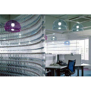
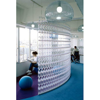
Walls made from water bottles, simply strung like beads on tension wires for the offices of Danone (they make Evian and Volvic water) by Klein-Dytham Architecture in Tokyo. If you look closely, you can see the frames that make it possible.
Other items could be assembled this way...I'm thinking rustic squares of recycled wood, children 's toys in a nursery...other ideas?
Nice design tie-in with the water bubble-y lighting, as well.


great design from cheap materials


Good design can be expensive. It pays its own dividends, though.
More on that later, but if you think that amazing things can't be done with even inexpensive materials........
....look what artist Tara Donovan does with styrofoam cups (bottom) and silver mylar sticky tape (tops). The mylar work is currently on exhibit at the Met. [photos via scoboco]
She also works with pencils, drinking straws, paper plates and tar paper, all of which can be seen at ace gallery.

I find these works inspirational because they are basically a repetition of simple forms using an everyday material. Labor intensive to be sure, but most churches have more wealth in hands than in money. With supervision and planning, a repetitive-form project is very doable by a church group.

Thursday, December 6, 2007

Inspiration in Glass


Most of the posts are intended to be more inspirational than literal...to provide churches with new ideas and thinking about exteriors, interiors, landscapes, furnishings, and building usage.

For example, here are some of this year's shortlisted winners from the Bombay Sapphire prize (also shown on dezeen), which gives awards for the innovative use of glass. Each of these concepts are profoundly meditative, and could be stunning additions to a church setting.

From top to bottom, "No 091138-05" by Yoav Reches, Zik Group- imagine this sort of stacked sculpture in a window frame as an alternative to stained glass; it looks as though it is assembled from commercial glass of different formulations (thus the different shades of blue-green), and I especially like the quilt-like nature of the block pattern, which would fit my midwestern setting especially well. "Attracted to light" by Geoffrey Mann would be a stunning ecclesiastical light fixture, and picture something like "Singing Water" by Eva Mendez over the altar...wow.

St. Bart and Panton


dezeen magazine (April 2007) featurea the interior of St. Bartholomew's church in Eastern Bohemia as redesigned by Maxim Velcovsky with Verner Panton chairs, crystal chandeliers, persian rugs and walls left in a partially stripped stage to show the progress of time. Whether it's your style or not, what's striking is how rarely this sort of design is seen in this sort of setting. Which is why I'm starting this blog.
Related Posts Plugin for WordPress, Blogger...