Thursday, May 29, 2008

Youth space DIY Round-Up


DIYable ideas for the youth room: (top to bottom) fluffy clouds made from coffee filters, tennis ball table (lots of hot glue needed), bicycle wheel table, and some funky lighting that looks to me like it is made of guttering that has holes drilled in and rope lights passed through.

Friday, May 23, 2008

'Nappak' for temporary shelter


Churches have traditionally served as gathering places in times of disaster, and my church wants to intentionally plan for this eventuality in design of the new buildings.

Part of that involves being equipped to provide temporary sleeping arrangements....the traditional solution for this is your basic cot, but the 'Nappak' seems a much better answer, providing at least a modicum of privacy that might help victims feel a bit more comfortable in spite of disorienting circumstances. And packing small for storage.

It seems to only be available in Germany at the present time.

Monday, May 19, 2008

Inspired by School Architecture


What does it mean to be making the 'place' of a church?


I've been learning from a document I ran across called "Enabling Place-Making: The Role of the School in Supporting the Community", by Prof. John Worthington, with its thoughts on what school architecture should mean and be.


One of the primary functions of the church is, of course, pedagogical, and so it is no great surprise that many of the principals translate well to thinking about the use and design of sacred architecture...replace 'school' with 'church' and you'll see what I mean.


"Buildings, well considered, can provide support to users by being:


  • efficient, by achieving more with less, reducing running costs and using space well;

  • effective, by improving staff and student satisfaction, adapting to new ways of teaching, attracting community commitment and improving learning outcomes;

  • expressive, of the values of the school and the community. The building, its fit-out and the way it is managed, can be used to transmit ideas and knowledge."

Many churches I've been in are poorly designed for all three. Modern churches, in particular, seem downright afraid of any expression of values, which is why they tend to be shopping-mall bland.


The conclusion of the article has fascinating implications for churches as well:


"Traditional categories of space are becoming less meaningful as boundaries blur and space becomes less specialised. Educational space needs are designed primarily around patterns of human interaction rather than the needs of particular subjects or technologies. New space models are focused as much on enhancing the quality of life as on supporting the learning experience. Circulation becomes the focus for interaction and informal learning.

Space is planned to:

  • support mobility, with touch-down settings, an abundance of power outlets, and movable furniture, and a rich variety of settings;

  • enrich pathways, by designing for chance encounters, encouraging the creation of ad-hoc workplaces, and providing opportunities for creative interaction;

  • blend and blur activities, for working, talking, eating and relaxing, by overlapping information-based work with entertainment, food and leisure.

Success comes through engagement, continuous commitment and attention. Space can be more than an irritant left to others. Space can be the catalyst for achieving pedagogical goals and improving performance."


What does it mean to design a church around patterns of human interaction? As I think about my church's new building(s), my primary inspiration for educational space is not other churches, but innovative schools.


[above, the Shiroishi #2 Municipal Primary School, Tokyo, by Taro Ashihara]


Wednesday, May 14, 2008

Cheap Fix - Simple Wooden Trim


California-based Mars Hill Studios seem to have developed something of a formula for warming up spaces with the application of simple wooden trim. Utilizing raw, unimproved lumber (looks to me like simple pine 2 bys and 1 bys, perhaps waxed for luster), and incorporating the bolts and braces as features of the designs, most of these ideas are within the reach of a lay carpenter, and are especially well-suited to remodels of austere office or shopping space.

(Nice color choice on that purple/green hallway, as well. But at my church I wouldn't be able to *tell* anyone I was painting it purple and green. I'd have to pretend I was painting it a nice, nondescript almond color. Then afterwards, they'd like it, but before....well, the deacons might have a stroke if I mentioned purple and green in the same sentence.)

Tuesday, May 13, 2008

Angling the Pews


From the website of New Mexico based Mazria, Inc.

"The seating arrangement in the Sanctuary is oriented at a 45 degree angle to the Bima, which reinforces the feeling of community during services."

In a older, traditional sanctuary with existing pews, simply changing their angle can make the space seem more friendly, less formal.

At my own church, which has a mixture of pews and chairs, space didn't permit a full 45 degrees, but several years ago we made a simple shift of about 30 degrees, which made quite a difference and was favorably received by the congregation. It also has the effect of better focusing the sight lines onto the center of the stage or the pulpit.

Thursday, May 8, 2008

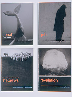
Pocket Canons


London based design group Pentagram's "radical repackaging of the Bible designed to reintroduce the texts to a contemporary audience."

KJV texts with introductions by famous (contemporary) authors, published by Canongate books in the UK. By 2006, the series been published in 12 languages and in 16 countries, selling well over a million copies.

Winner of a Publishers' Publicity Circle award in 1998 as well as multiple other design awards.

There's nothing inherently spiritual about black leather bindings and gold gothic letters...

[See also the previous post on Crush Co's 'Summer Bible'.]

Church of the Visitation, Texas, 1895


Westphalia, Falls County, Texas. As beautifully photographed by Matthew Magruder for the Texas Church Project, documenting historic houses of worship.

Cross-bracing in the ceiling creates a simple, beautiful rhythm...long before E. Fay Jones used it to spectacular effect at his Thorncrown Chapel.

And what sensitive soul went to the trouble, in 1895, to lay the wood floor diagonally?

Saturday, May 3, 2008

Study in Contrasts in Iceland


The aesthetic strength of this church building comes from the contrast between the rough, rustic quality of the dark cladding and the refined elegance of the bright-white trim. This would be a striking choice of finish materials for a small church, without resorting to anything unusually expensive.


Friday, May 2, 2008

But can I call it stained glass?


The pendant light made from Campari soda bottles by Ingo Maurer. About $600 (for soda??) so make your own. Great for the youth room.
Related Posts Plugin for WordPress, Blogger...